UX-UI REDESIGN: Abington public Library
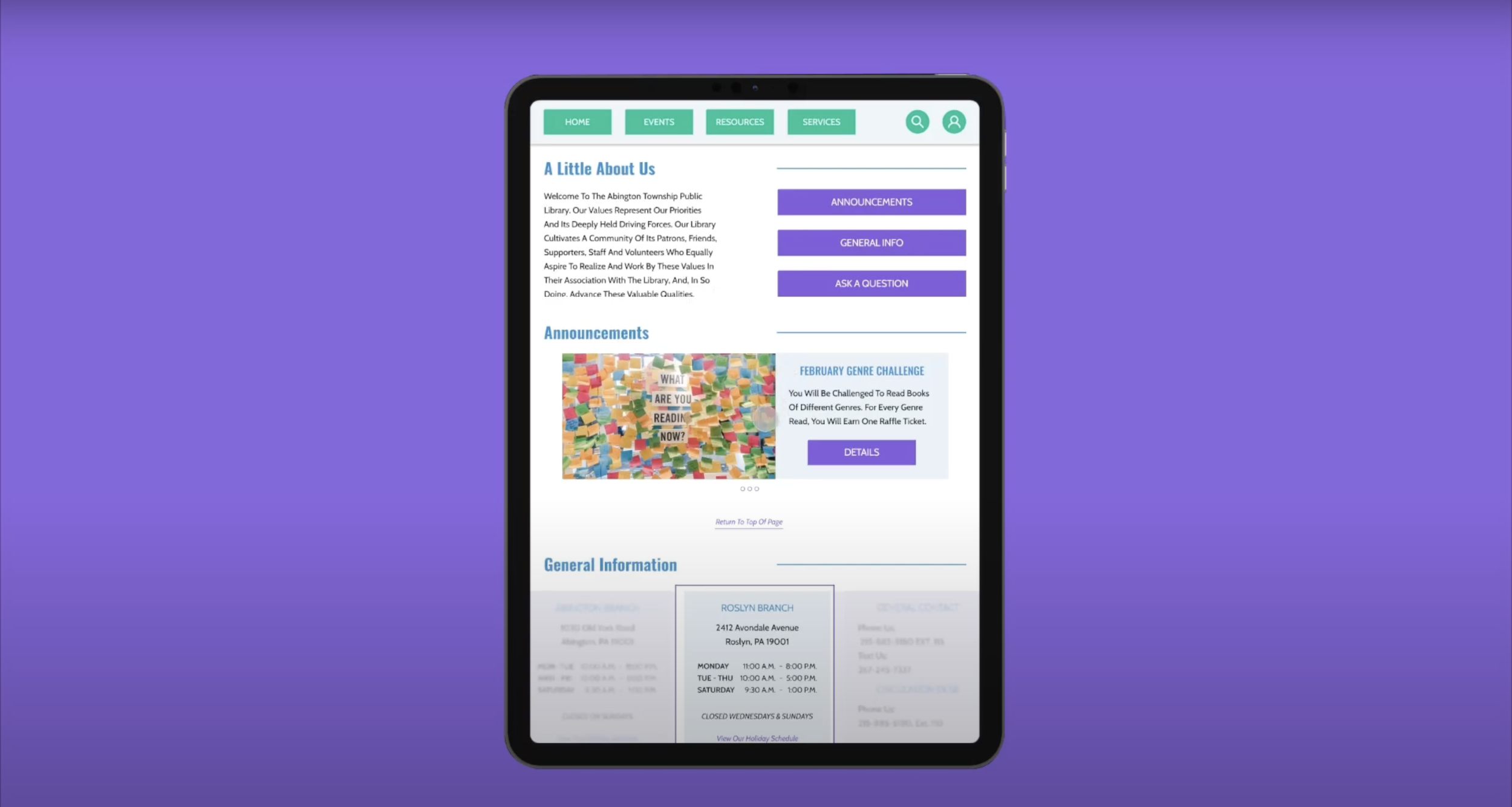
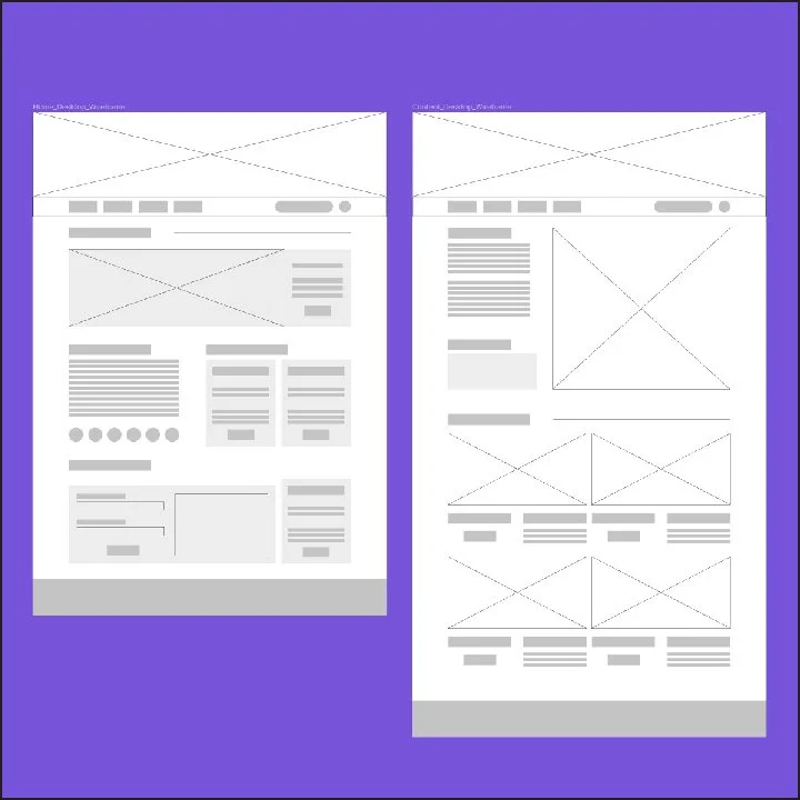
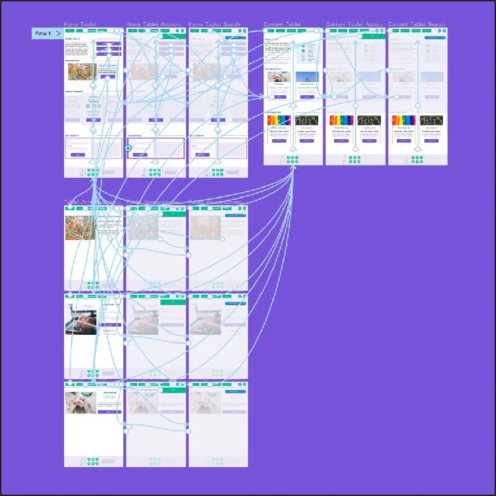
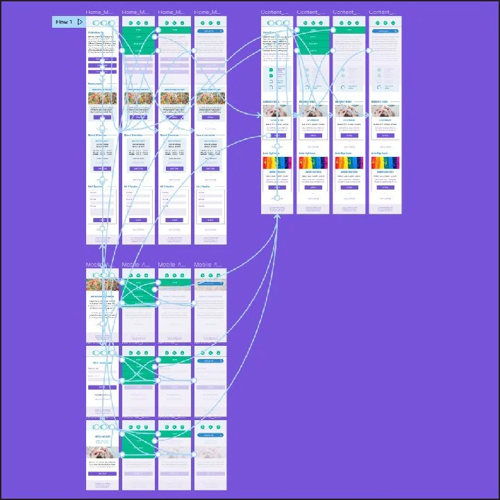
As a part of this project I was tasked with redesigning the desktop, tablet, and mobile experience for a public library. The goal was to create a basic outline for the new design approach. The original site struggled with organizing its large volume of content so the largest change I made was restructuring the primary navigation . From there, I implemented a strict color palette for more cohesion across the site and vastly improved the typographic hierarchy to better organize the information. The desktop experience was created first. The tablet and mobile versions where then created and flushed out with more detail, using the desktop version as reference.
ORIGINAL WEBSITE


