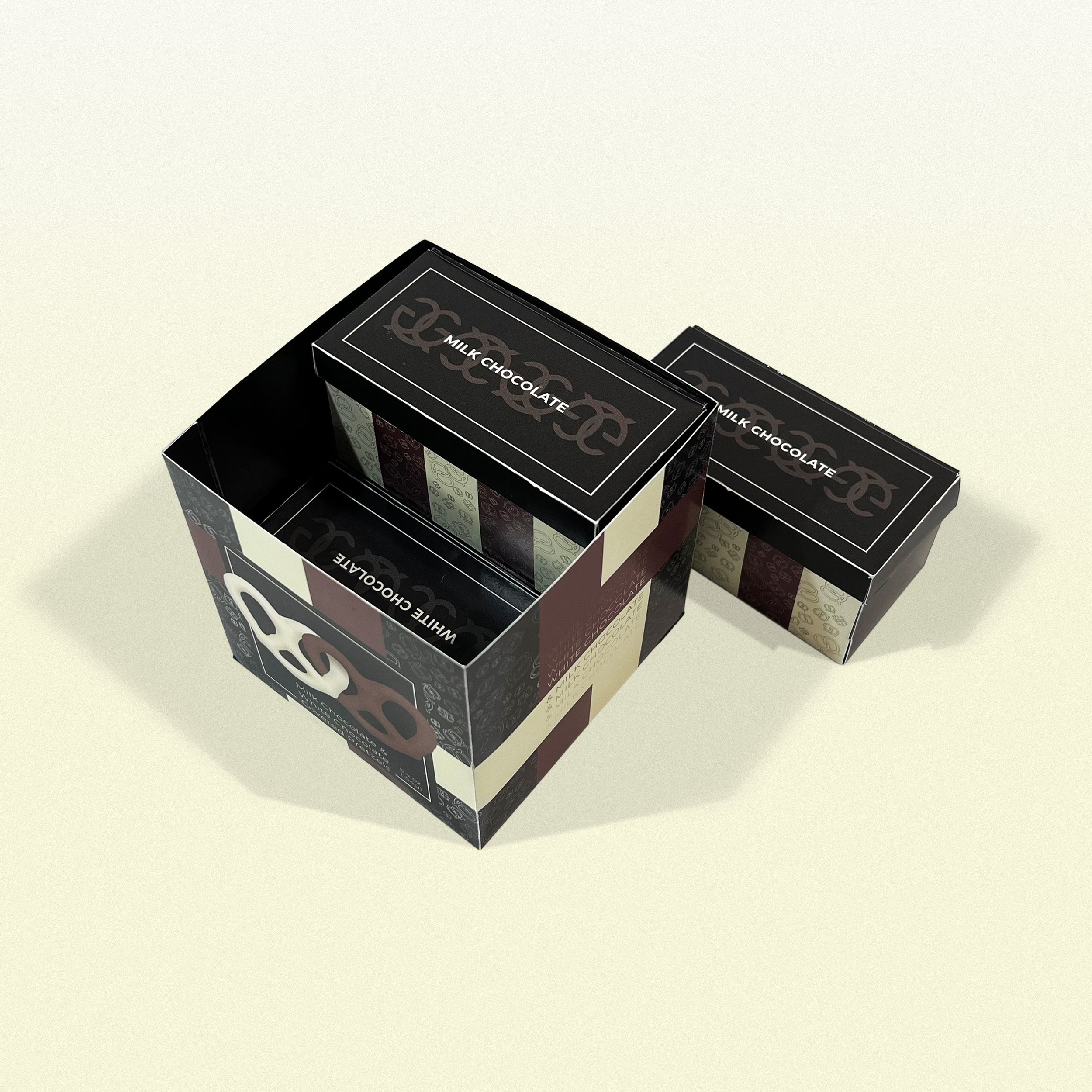
Package Design: Knights
I was tasked with creating a visually interesting package design for a food product—I chose chocolate pretzels. There were several restrictions put in place. For instance, the final product must use no glue/tape, must be a box, and must protect the product from external exposure. The logo I created was reminiscent of the Gucci logo, this led me to take inspiration from high-end designer brands. My final package utilized a snap-lock fold for the bottom of the box and a simple tight lid for the top. The color palette was black/white, a light brown and off white, representing the two main pretzel variations. The style was kept simple, primarily relying on the colors and minimal typography to achieve an elegant look. A delicate pattern made of vector pretzels was included to add a bit of fun to the whole composition.
process


